Aria
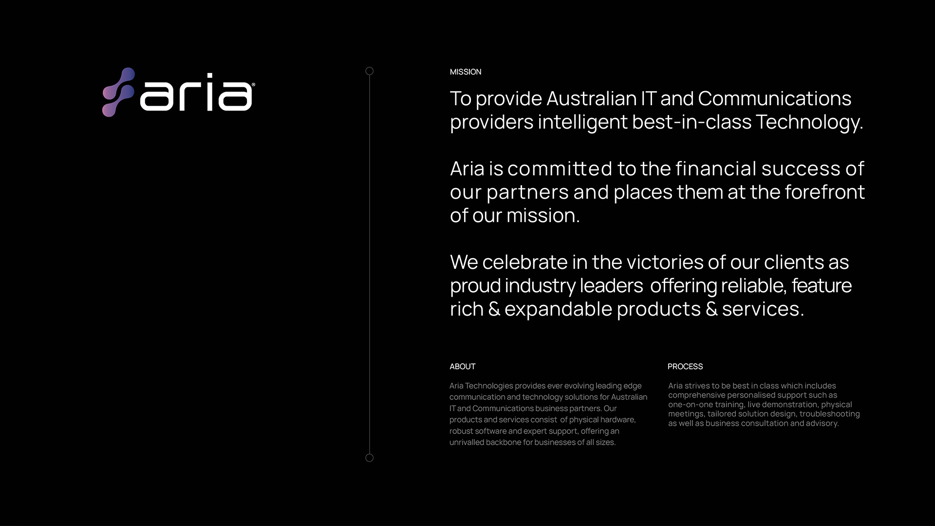
Aria Technologies provides ever evolving leading edge communication and technology solutions for Australian IT and Communications business partners.
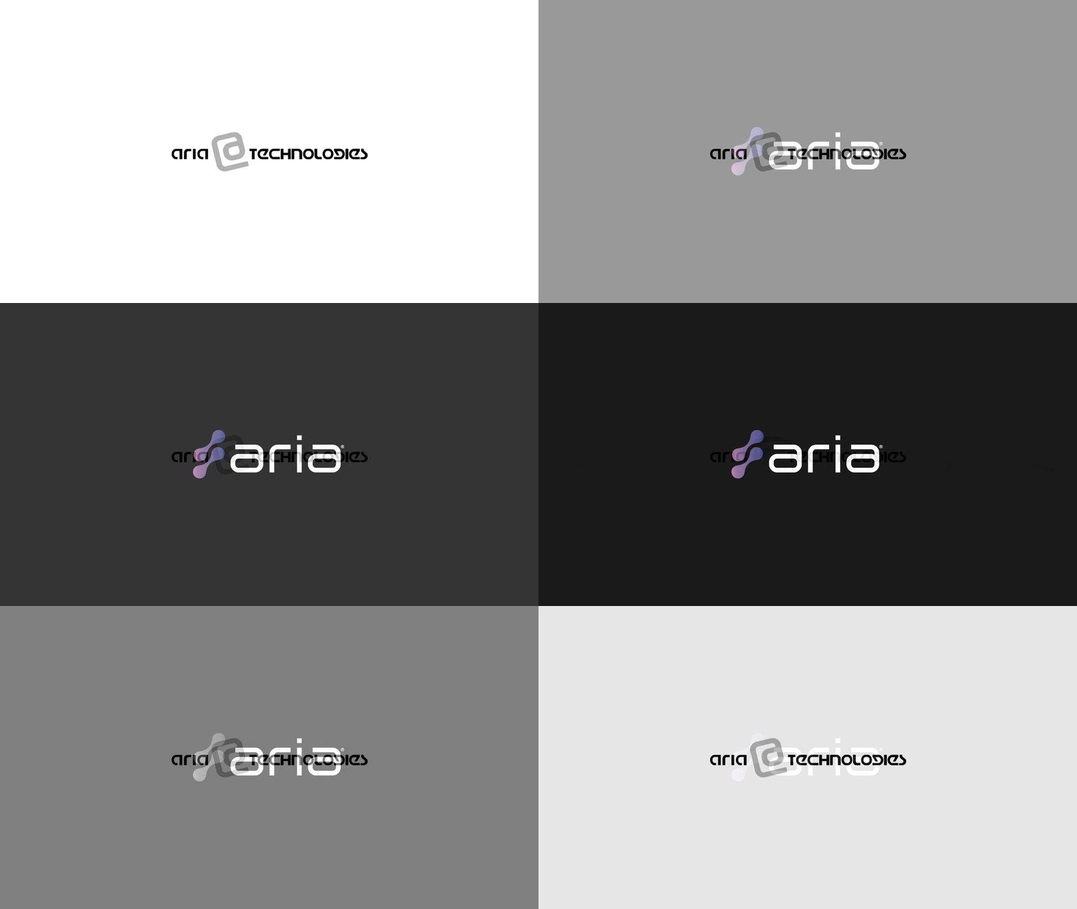
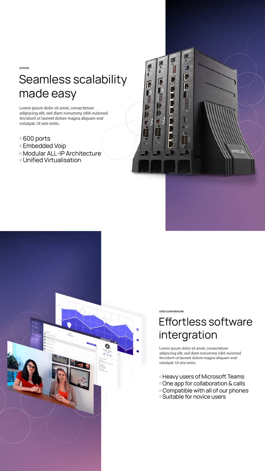
This was a ground up refresh of the brand that had not changed since 2000. This well overdue industry leading brand update was carefully constructed to represent diversification, innovation and evolution. Aria was initially a telecomunications provider, proudly the lead distributors of Ericsson-LG and iPECS products. Since the businesses inception, Aria have grown in a full scale technology provider offering a suite of IT and Telecommunications products and services. The original branding and website didn’t age well or align with their current audience and new prospects.
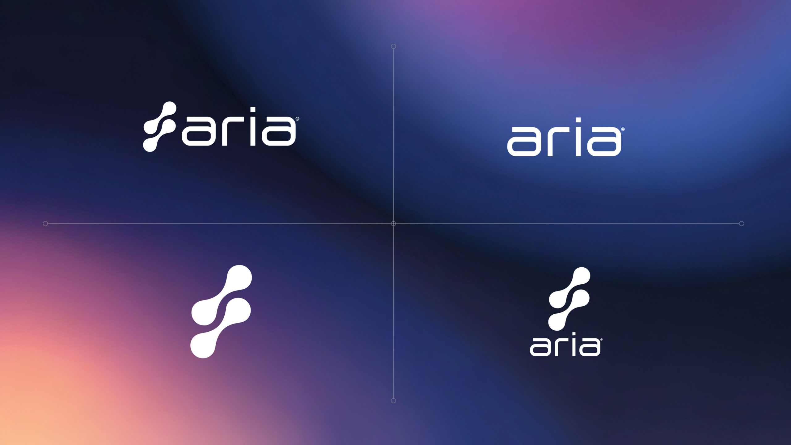
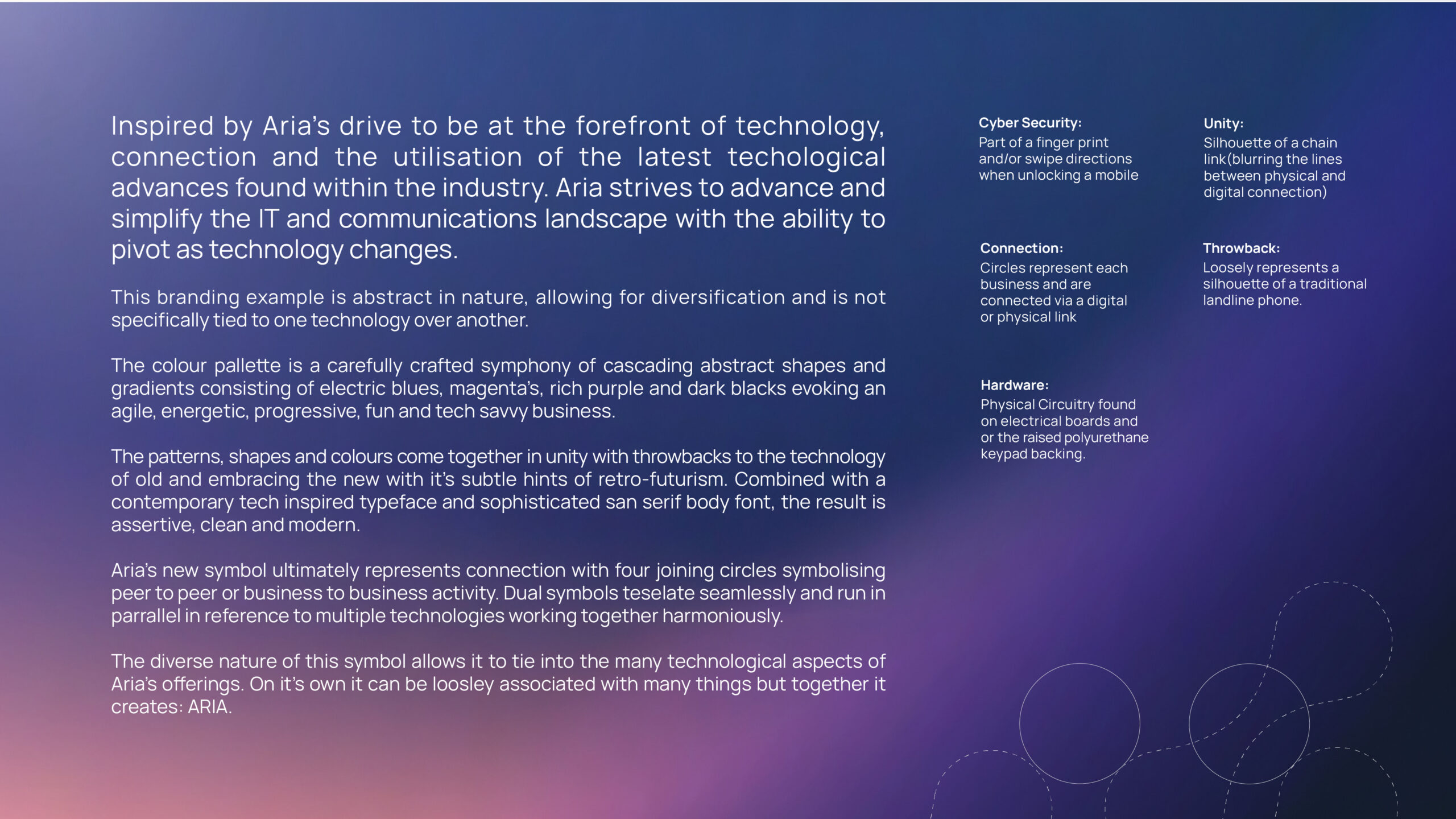
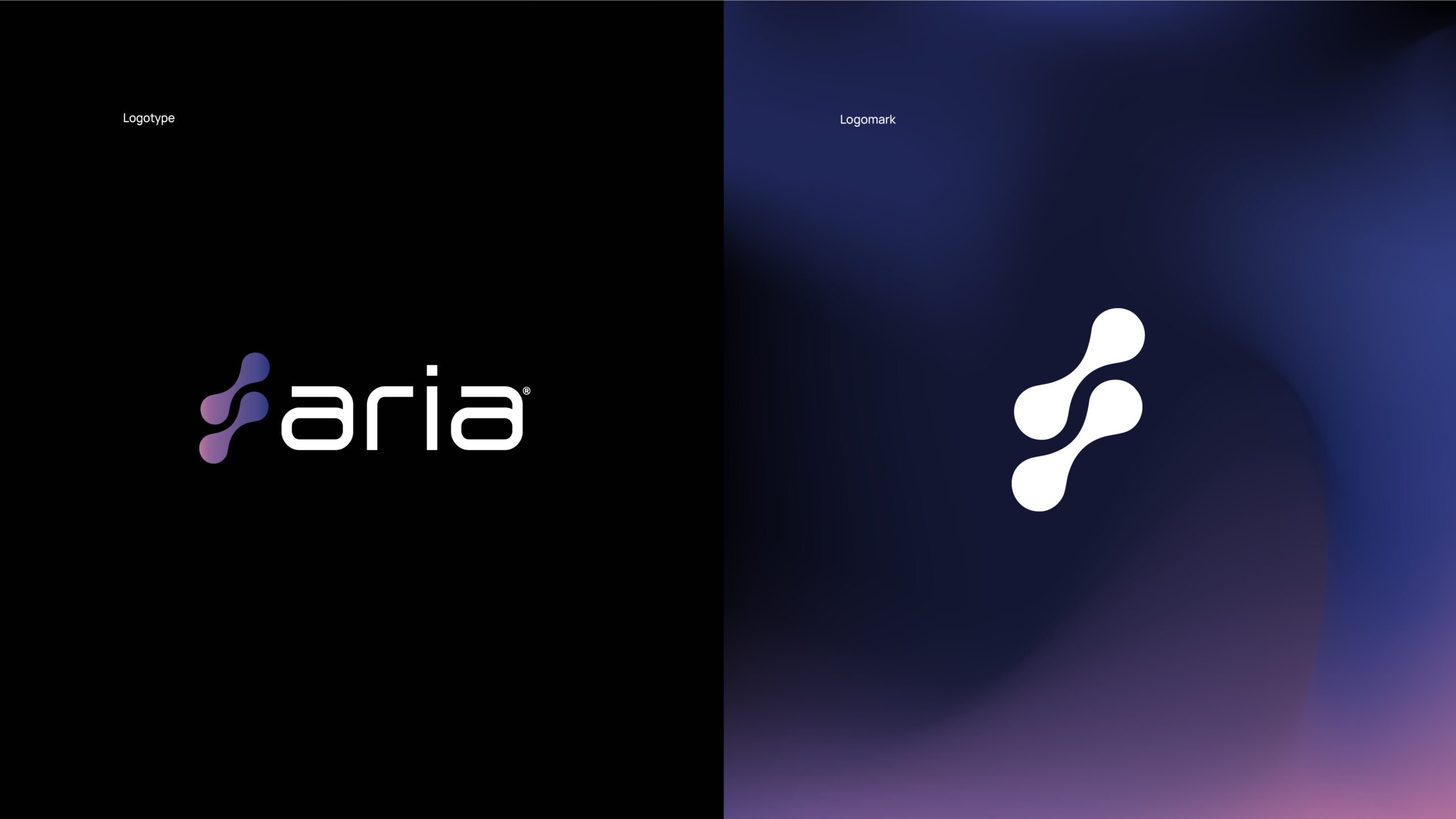
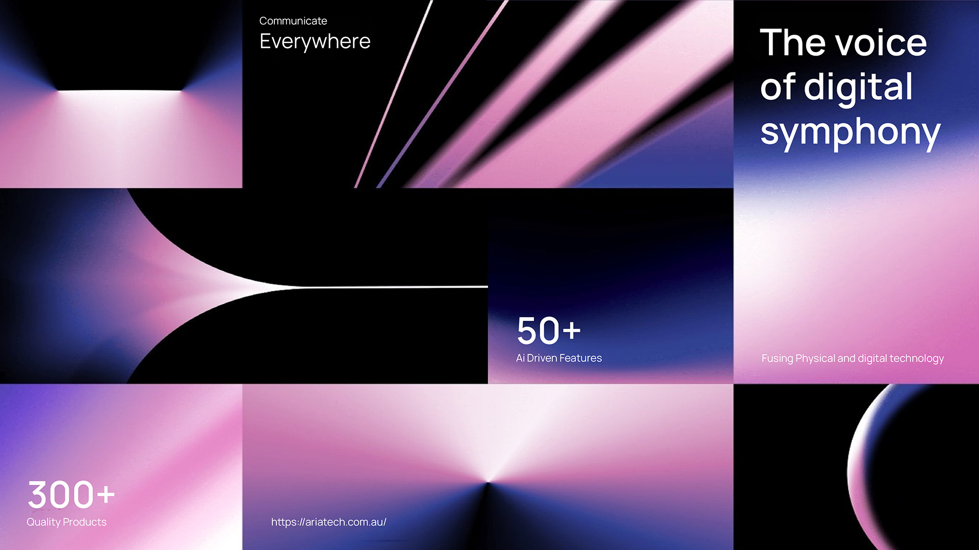
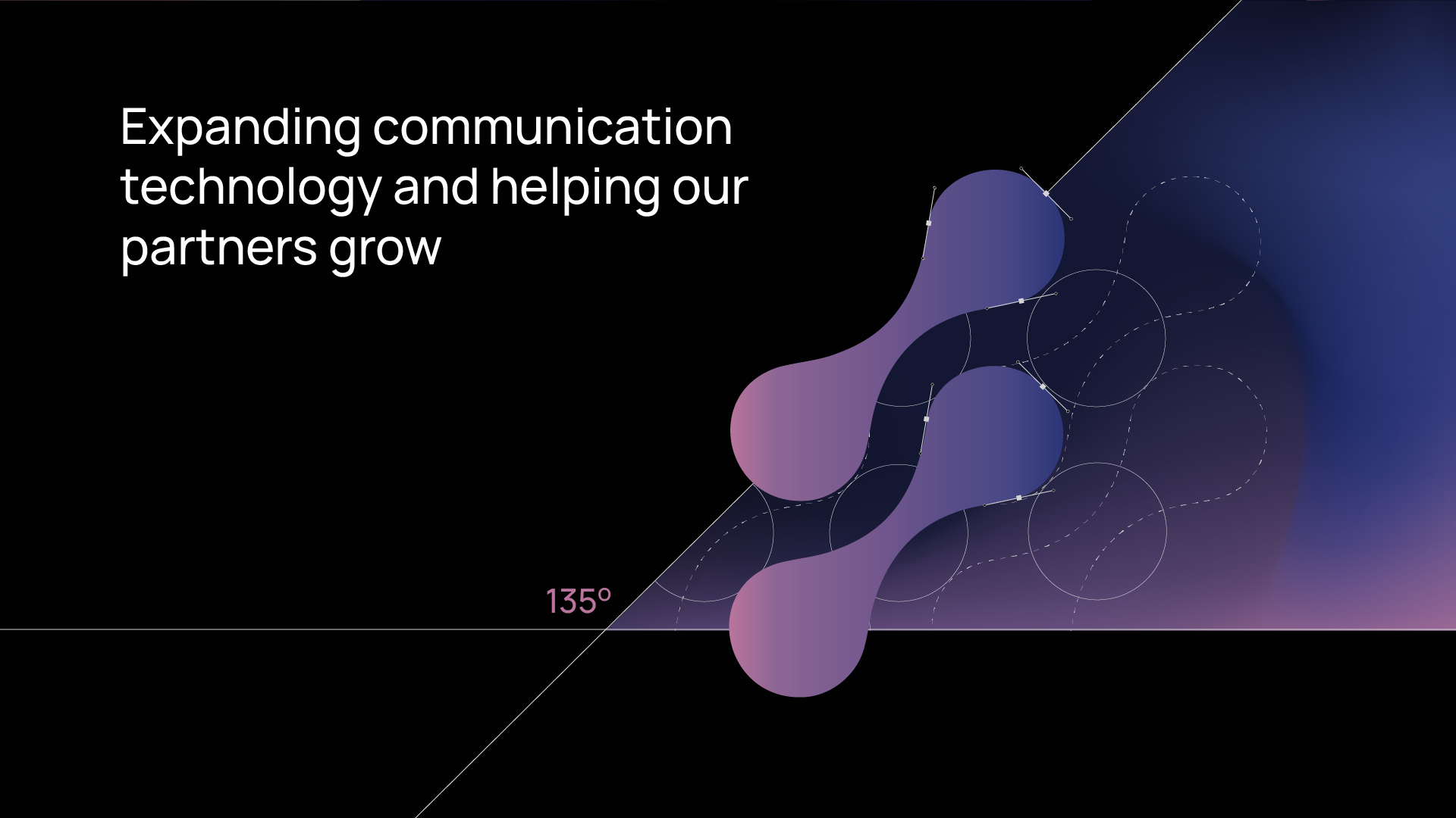
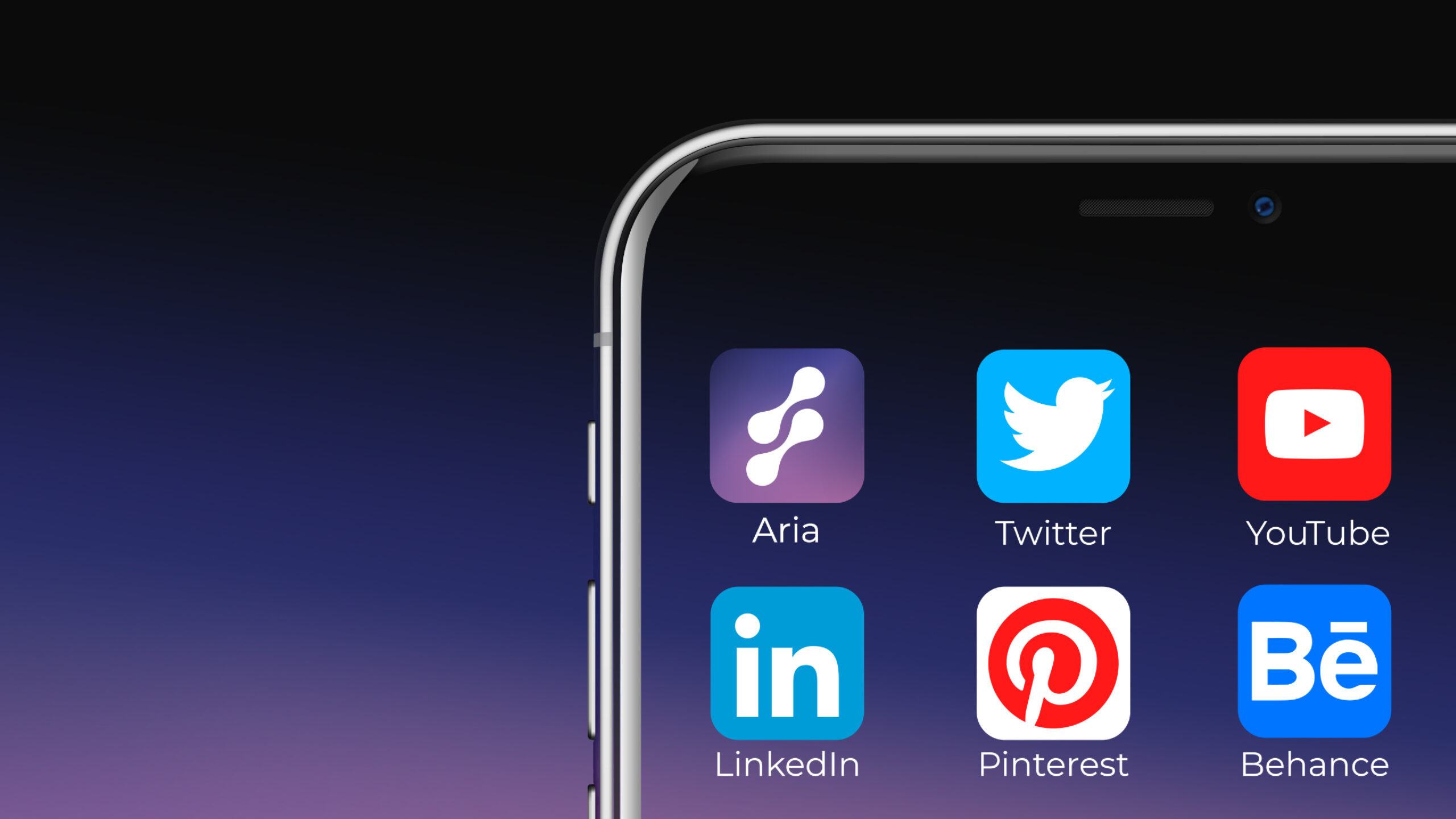
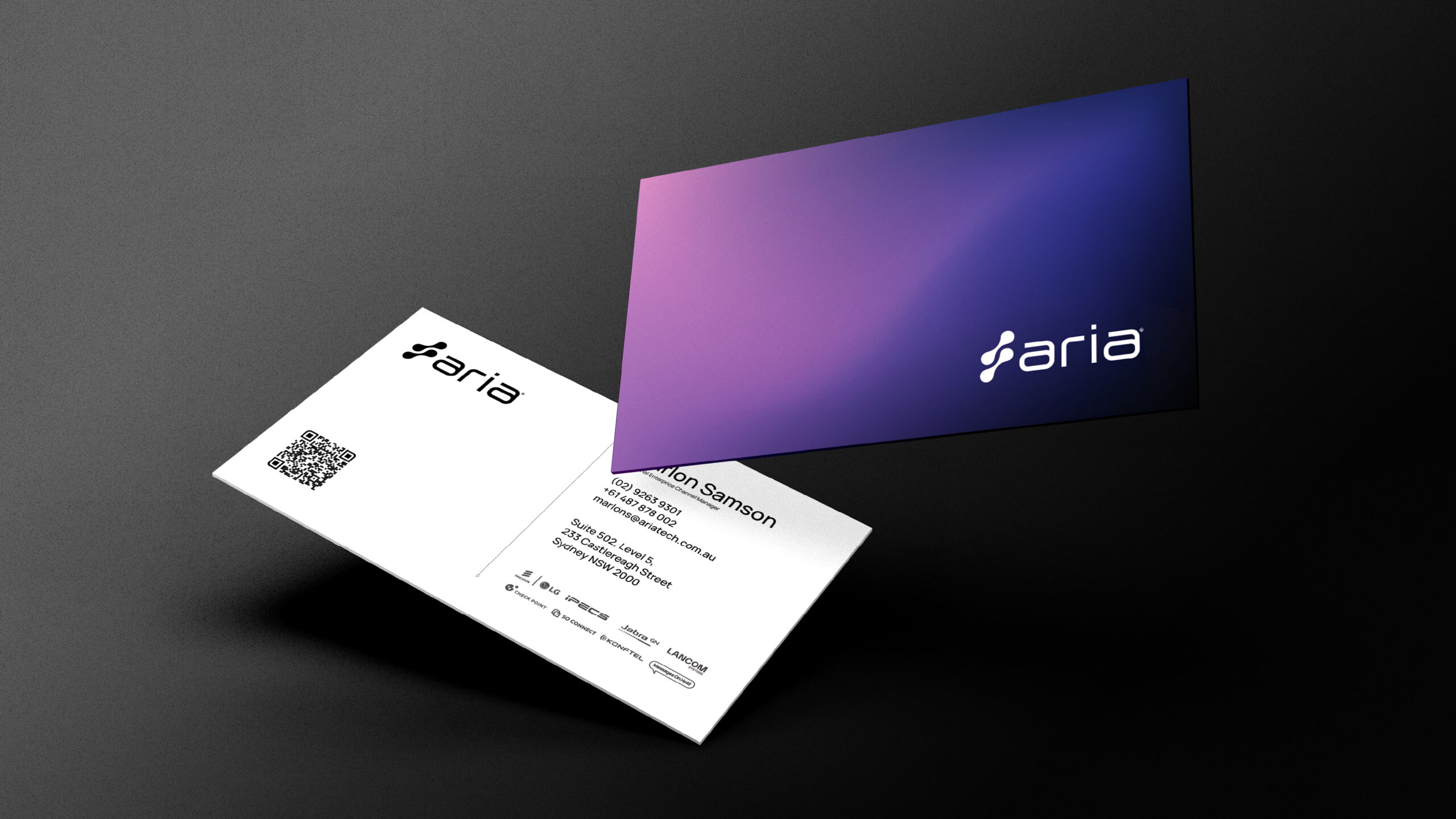
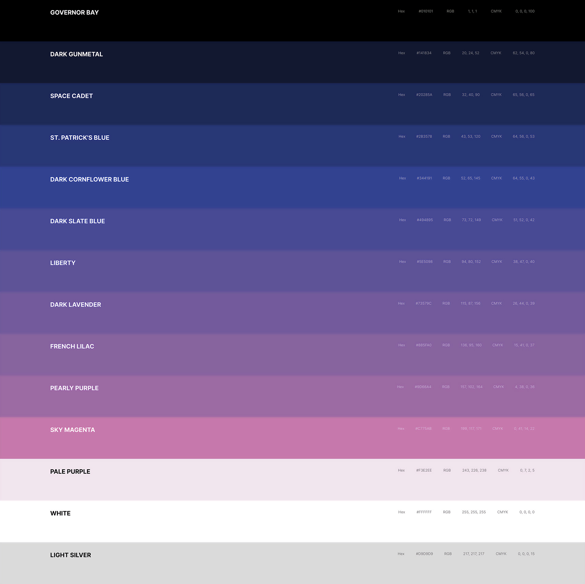
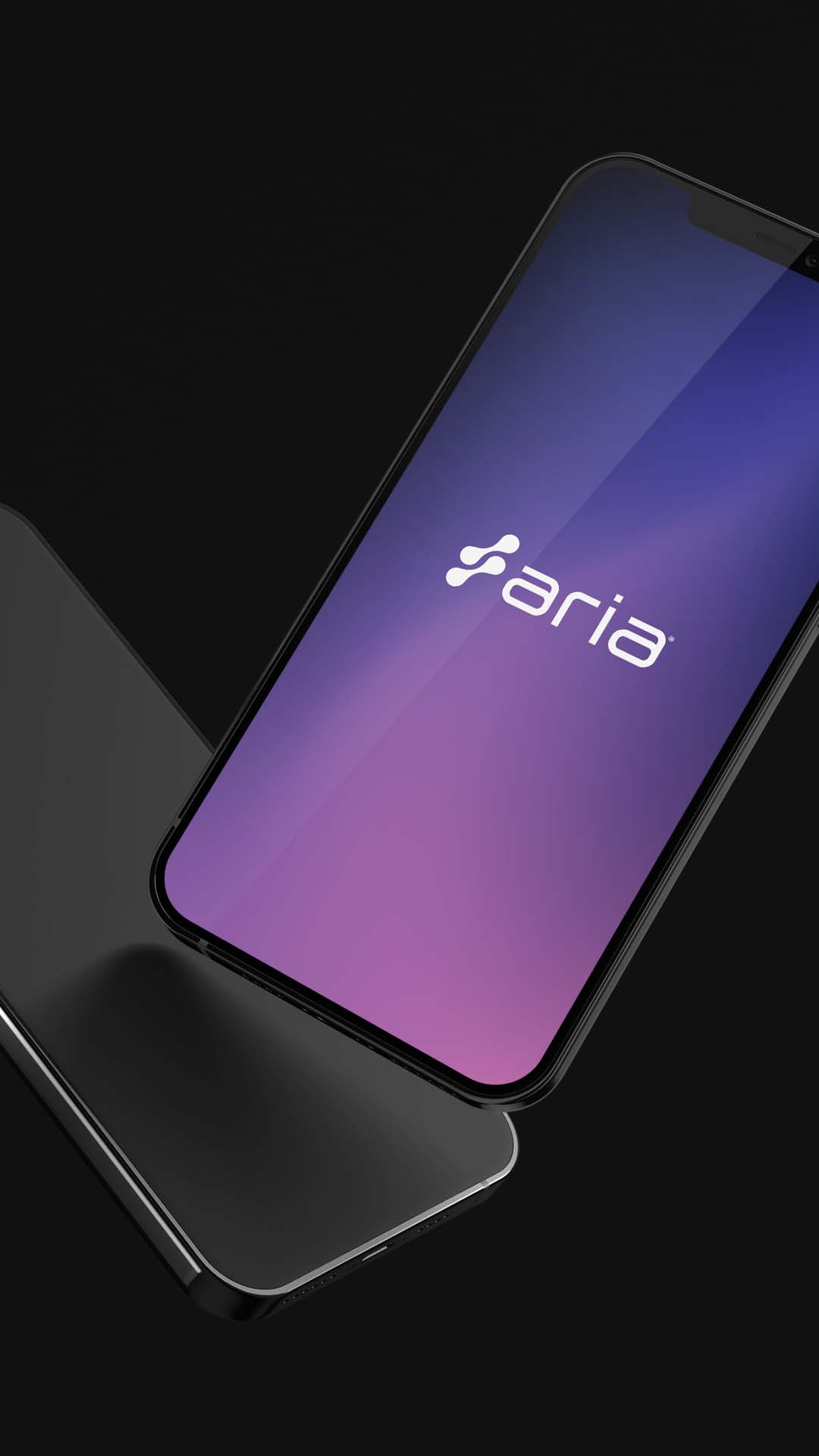
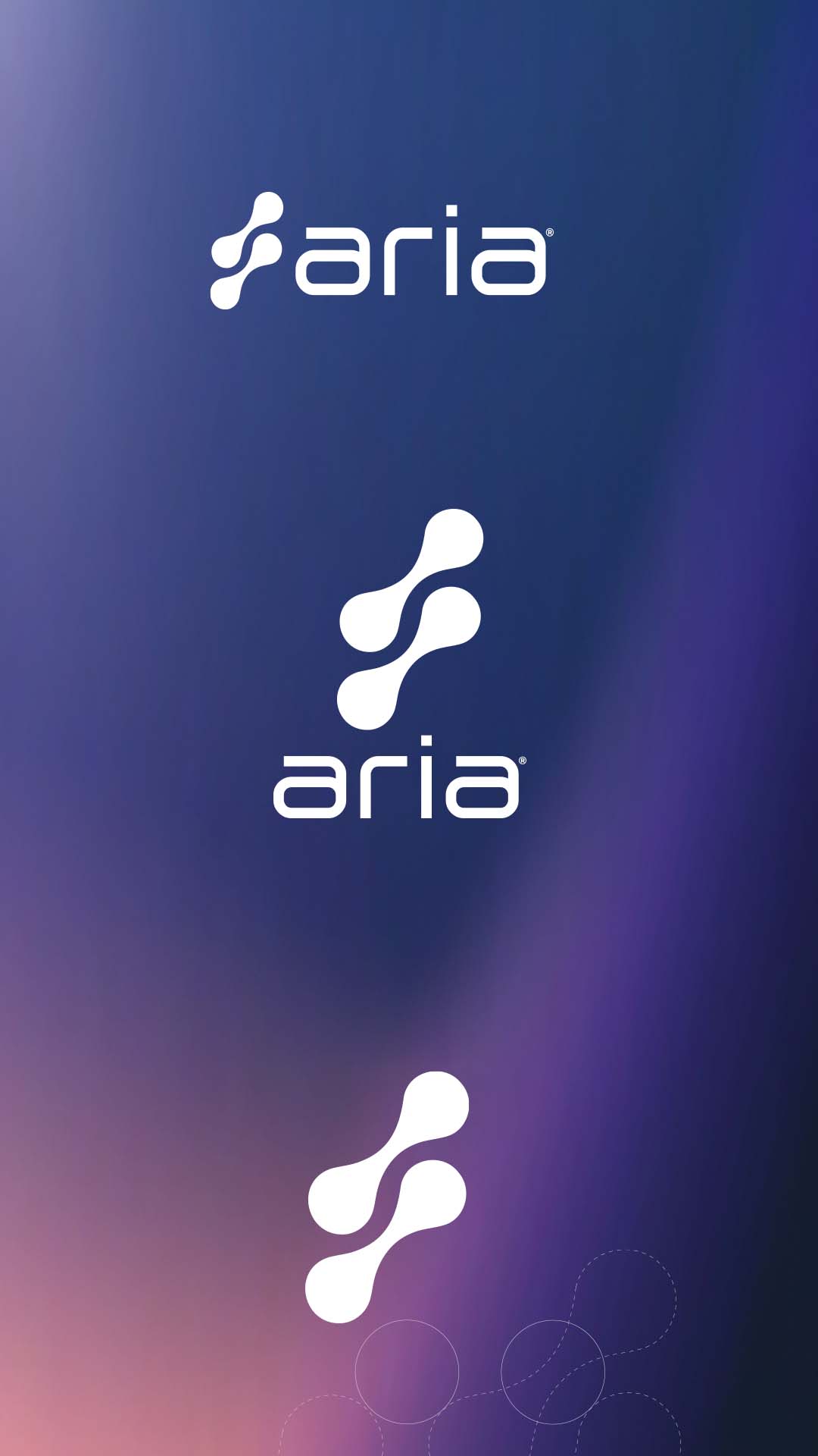
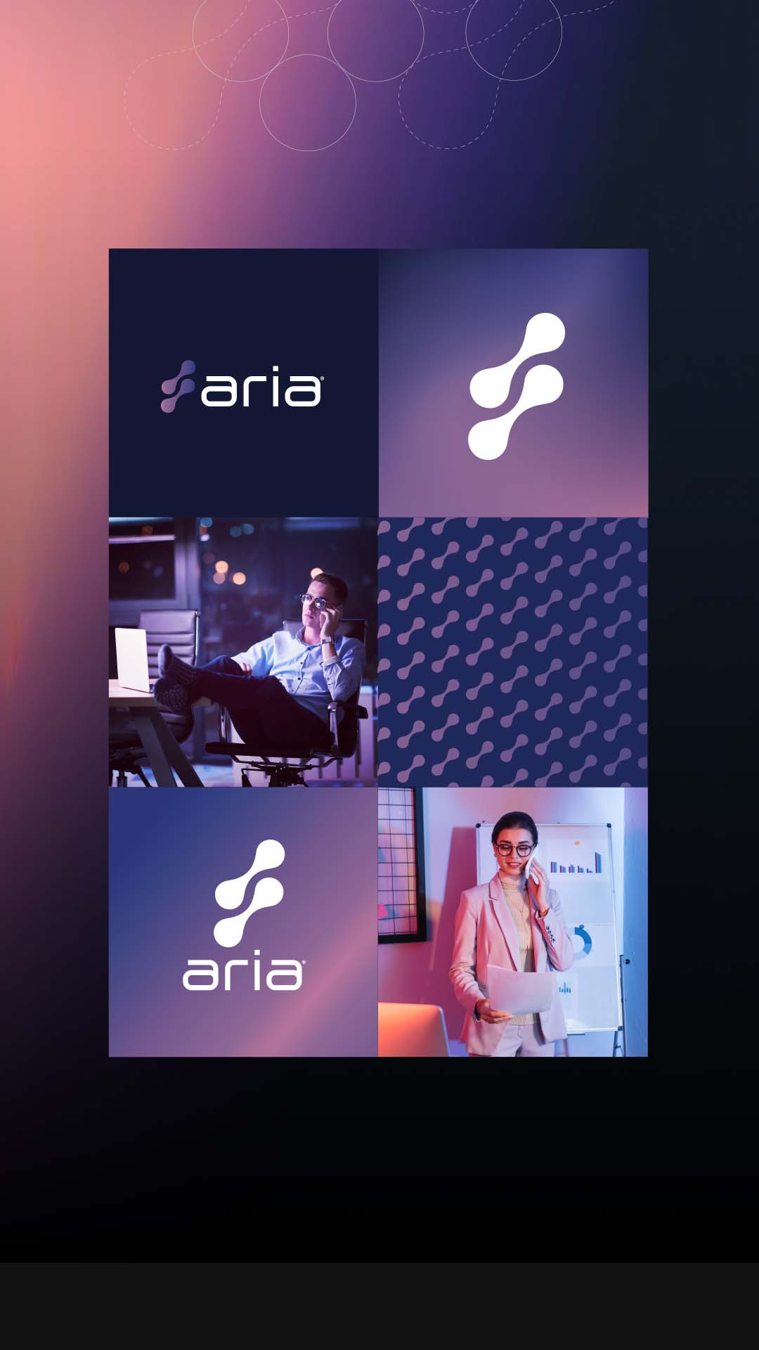
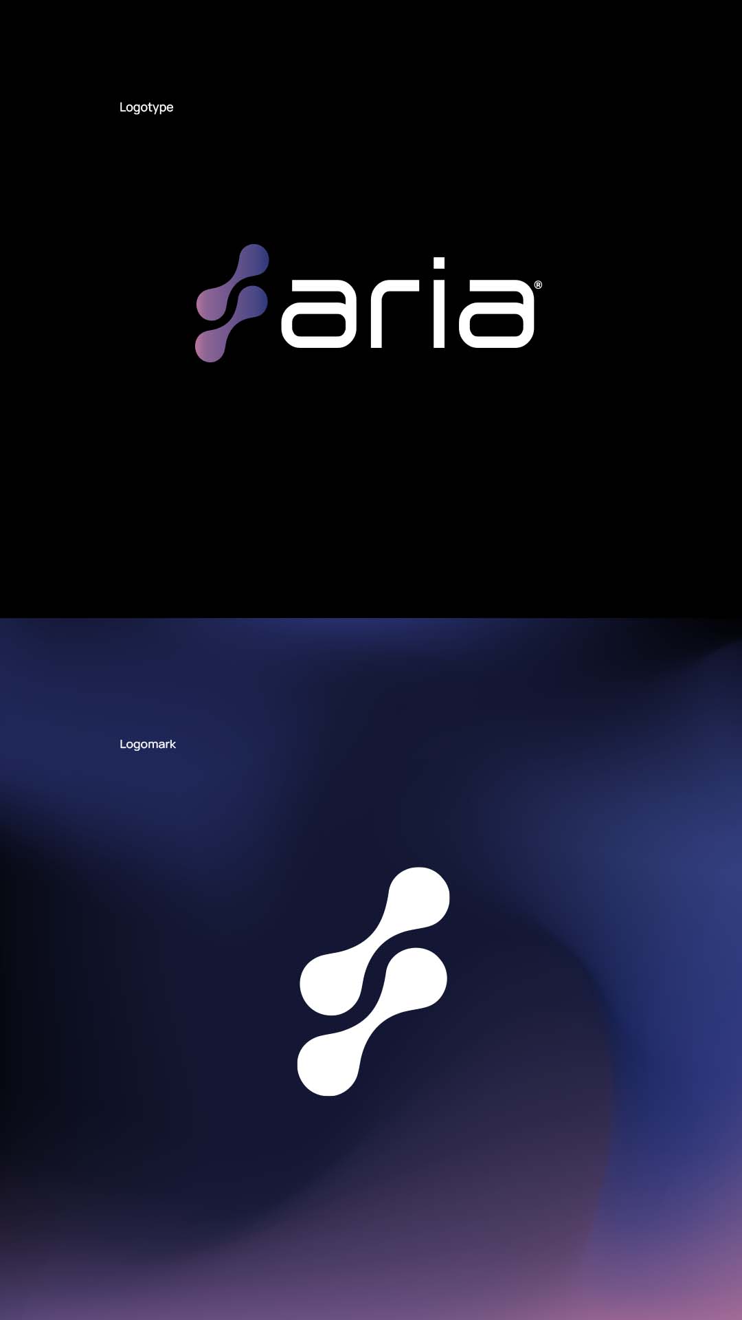
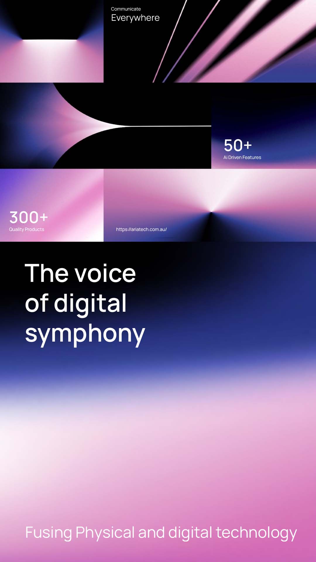
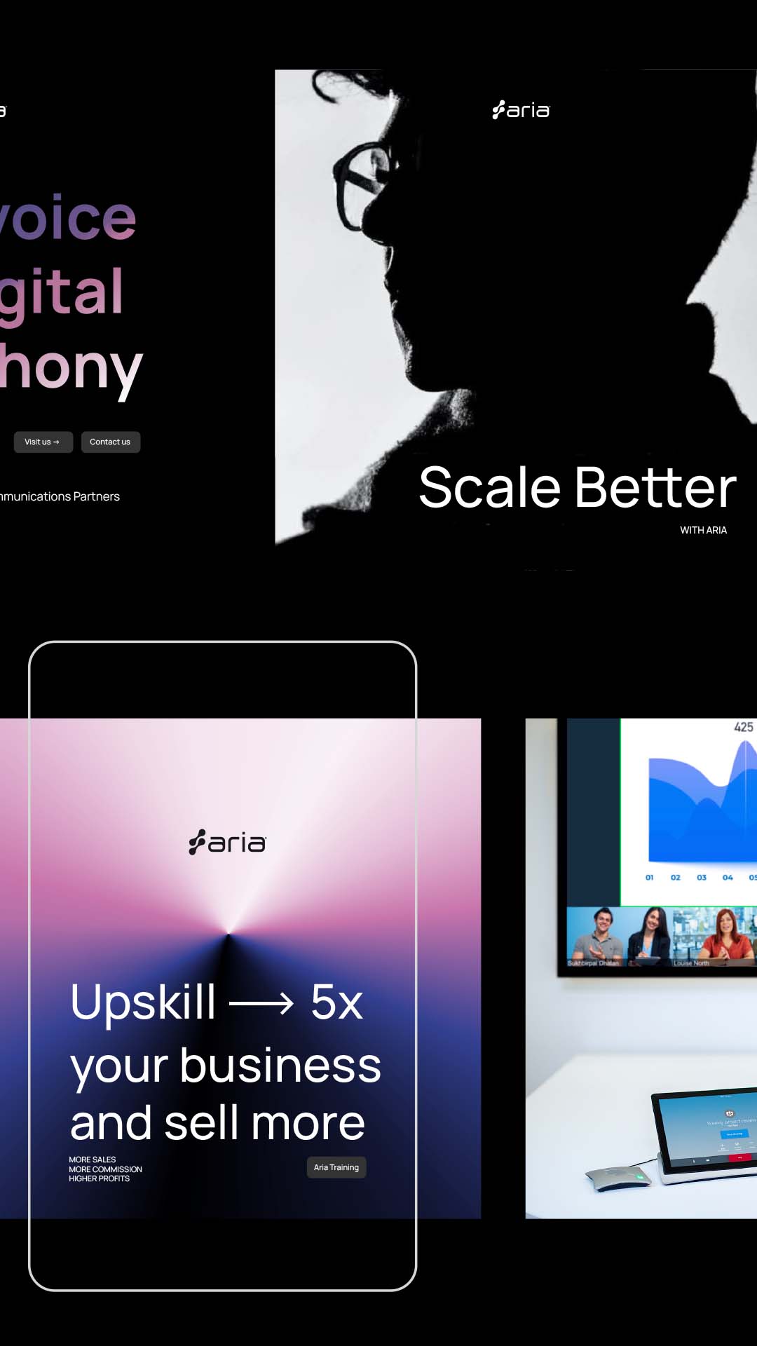
The new brand utilises a colour pallette of carefully crafter symphonies of colour, cascading abstract shapes and gradients. Consisting of electric blues, magenta’s and rich purple to evoke an agile, progressive, fun and tech savvy business. Aria’s new logo ultimately represents connection with four joining circles symbolising peet to peer or business to business activity. The symbols teselate seamlessly and run in parrallel in reference multiple technologies working together harmoniously. Stern yet simple typfaces and free flowing uncluttered and targeted design ensures information is clear and easily absorbable.
The end result is a glorious specimen of targeted and effective design aimed at IT and Telecommunication professionals Australia wide.
ClientAria TechnologiesServicesBranding | Web Design & Development | Print CollateralLinkariatech.com.au
